Don't miss a gem


Founder & CEO
Founder of The Jewels Club, Andrew creates platforms that connect the world of jewellery through community, content and access.
For decades, TASAKI has been intrinsically linked to pearls. The Japanese maison built its global reputation on cultured Akoya pearls, later expanding into diamond-forward collections that retained a sculptural, fluid quality. Now, with the launch of its first dedicated Metal Jewellery Collection, TASAKI makes a deliberate move away from gemstone and pearl centrality — placing form, proportion and surface at the forefront.
This is not a radical departure. It is a material recalibration.
Rather than abandoning its identity, TASAKI refines it. The curves, symmetry and architectural balance that have long defined its pearl collections now appear in 18k gold alone — stripped back, clarified, and arguably more exposed.
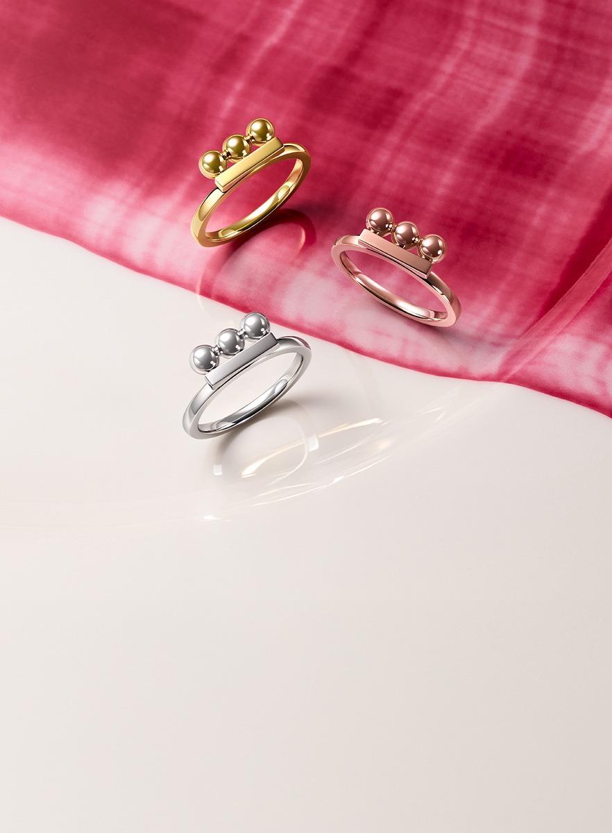
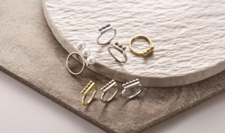
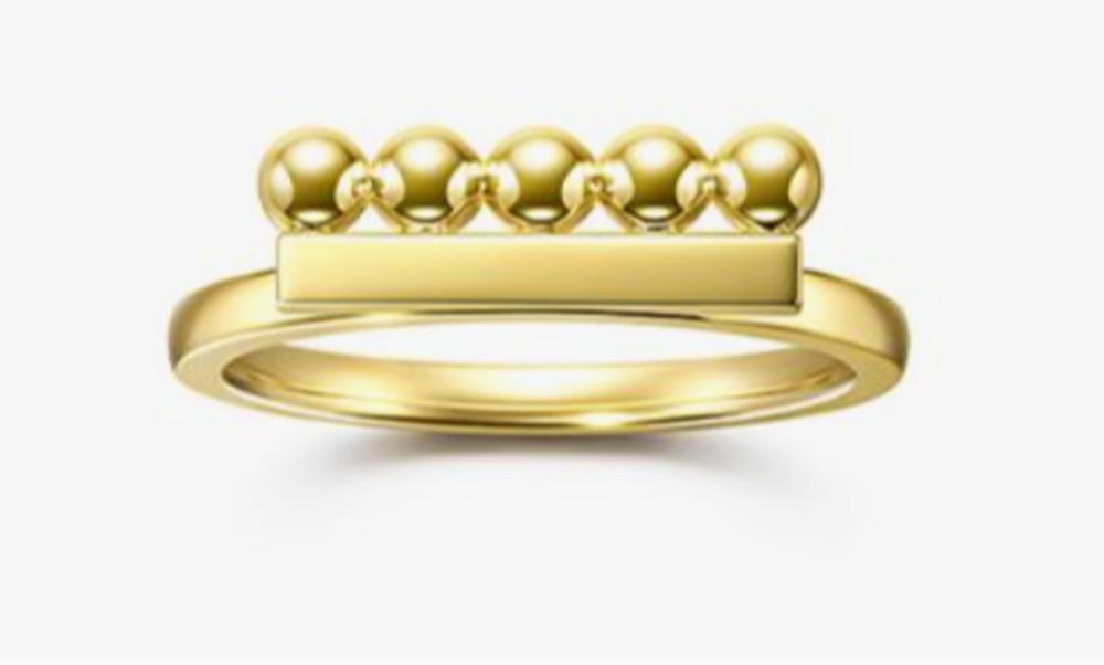
At the core of the collection is a metal reinterpretation of the house’s recognisable Balance motif. Traditionally expressed through pearls aligned in measured rhythm, the concept is now realised through polished gold spheres arranged horizontally across the finger.
Without pearls to soften the composition, the geometry becomes more assertive. The spheres read as pure form — deliberate, structured, almost architectural. Offered in 18k yellow gold, 18k white gold and 18k SAKURAGOLD™, the design relies entirely on proportion and finish to create impact.
SAKURAGOLD™, TASAKI’s proprietary rose-hued alloy, adds a warmer tonal dimension, reinforcing the brand’s continued interest in nuanced metal colour rather than conventional pink gold.
A secondary expression within the range refines the Balance concept further, reducing the number of spheres and amplifying negative space. The result is a ring that feels pared back yet confident — minimalism not as trend, but as structural clarity.
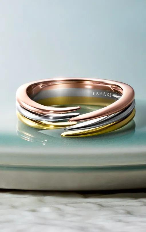
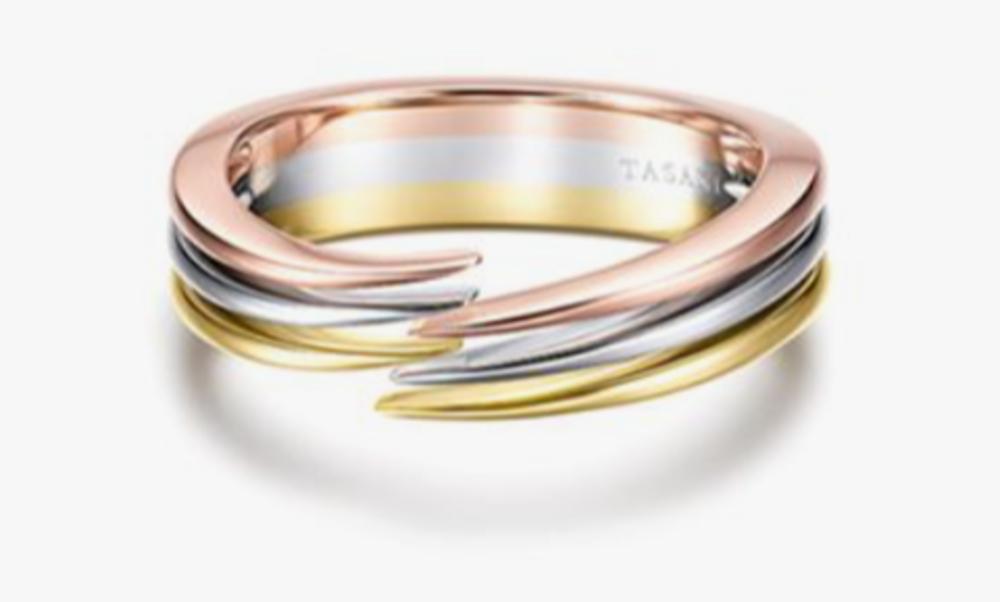
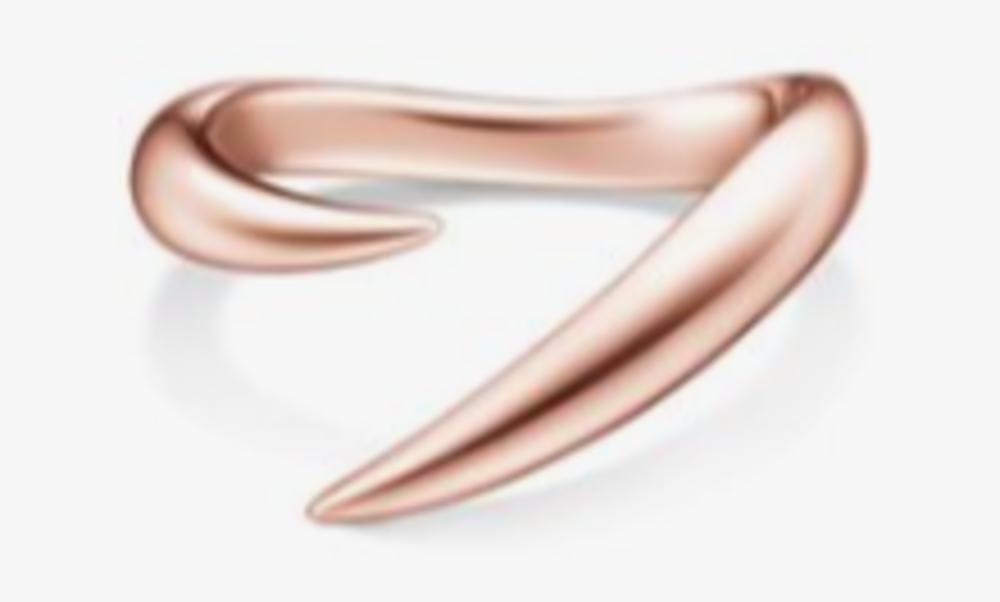
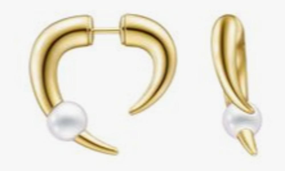
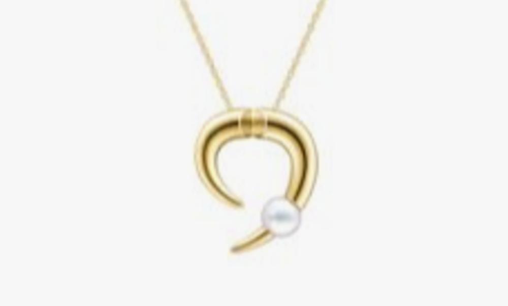
Also included is the Danger Horn Plus Ring, a metal iteration of the maison’s established Danger motif. Here, pointed arcs and curved surfaces meet in a composition that feels more directional than decorative. Without diamonds or pearls, the emphasis falls entirely on silhouette.
This is metal used not as a support material, but as the subject itself.
Tasaki metal collection
TASAKI’s decision to introduce an all-metal collection is strategically significant. Many heritage houses move from metal into gemstones; TASAKI is moving in the opposite direction — refining its forms to their most essential state.
It suggests confidence.
When a brand known for pearls removes them, it is effectively asking whether its design language can stand alone. In this case, the answer appears to be yes. The curves remain recognisable. The balance remains precise. The aesthetic remains controlled and modern.
The absence of stones forces attention onto craftsmanship — polishing, proportion, and surface tension between convex and concave forms.
Importantly, the Metal Jewellery Collection does not reject TASAKI’s heritage. The structural DNA of Balance and Danger is intact. What changes is the material hierarchy.
Pearls once defined the silhouette. Now the silhouette defines itself.
This shift aligns with a broader industry movement toward versatile, everyday gold pieces that carry strong design signatures without relying on high carat weight or overt embellishment.
TASAKI’s first metal jewellery collection is compelling precisely because it is restrained. There is no spectacle here — only precision. By removing pearls and diamonds, the maison reveals the strength of its underlying forms.
In a market saturated with gemstone maximalism, this clarity feels considered.
It will be interesting to see whether this is a standalone chapter or the beginning of a deeper material evolution for TASAKI. Either way, the message is clear: the house’s design language is strong enough to stand on gold alone.
Explore TASAKI’s new Metal Jewellery Collection, including metal interpretations of the Balance and Danger motifs, and see how the Japanese maison is refining form through material focus. takski.co.uk
Scroll the gallery below to see more

Pomellato’s “A New Chapter in Bold”: Chiaroscuro, Colour and the Essence of Elegance
Pomellato unveils its 2026 campaign — a striking, shadow-drenched celebration of form, colour and quiet power
READ MORE
Roberto Coin at VicenzaOro Winter: A Season of Colour, Craft and Modern Mythmaking
Roberto Coin unveils vibrant new collections at VicenzaOro, blending colour, craft and symbolism
READ MORE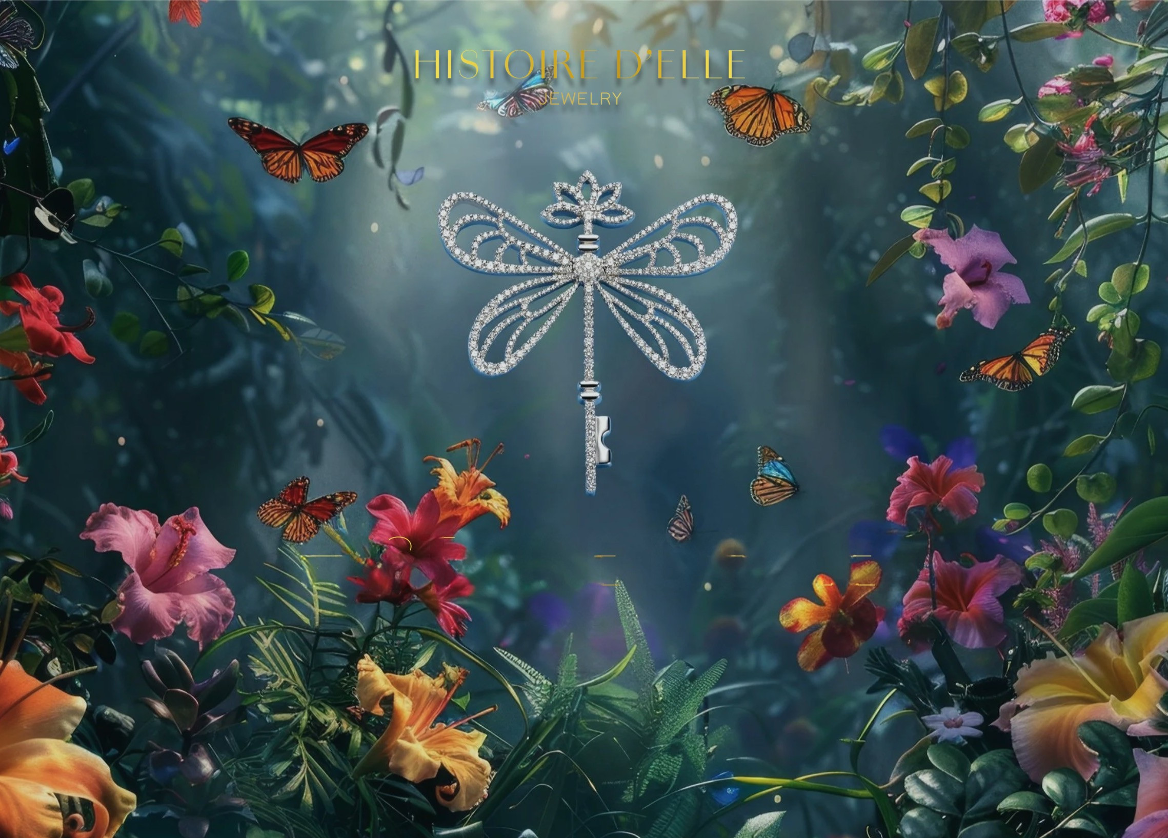
Histoire d’Elle at VicenzaOro: Where Nature and Femininity Converge in Diamond Storytelling
Histoire d’Elle stood out at VicenzaOro with distinctive, story-led collections rooted in femininity and nature
READ MORE

0 Comments
You must be logged in to comment. Click here to login.